Typography selection is more than just choosing pretty letters; it’s a powerful tool that can communicate your brand’s personality, values, and message. Selecting the right fonts is essential for creating a cohesive brand identity and making a lasting impression on your audience. This guide will walk you through the key principles of font selection.
Why Typography Matters
Fonts are the visual voice of your brand. They evoke emotions, convey style, and influence how your message is perceived. Consider these points:
- Brand Personality: A playful script font will communicate a very different message than a bold, geometric sans-serif. Your font choices should reflect your brand’s personality and values.
- Readability: Above all else, your fonts must be readable. Users should be able to easily scan and comprehend your content.
- Visual Hierarchy: Typography helps create visual hierarchy, guiding the reader’s eye and emphasizing key information. Use different font weights, sizes, and styles to create a clear structure.
- User Experience: Well-chosen typography enhances the overall user experience, making your website more enjoyable and engaging to browse.
Key Considerations for Font Selection
- Target Audience: Who are you trying to reach with your brand? Consider their demographics, interests, and cultural background. Different fonts may resonate with different audiences.
- Brand Message: What is the core message you want to communicate? Your fonts should support and reinforce your brand message.
- Industry Conventions: Some industries have established typography conventions. For example, serif fonts are often used in the legal and financial industries, while sans-serif fonts are common in tech and design. While you don’t have to strictly adhere to these conventions, it’s worth considering them.
- Font Pairing: Combining different fonts can add visual interest and create a more dynamic design. However, it’s important to choose fonts that complement each other and create a harmonious look.
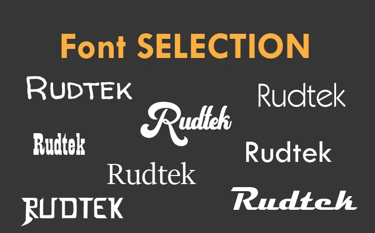
Types of Fonts
- Serif Fonts: Serif fonts have small decorative strokes at the ends of the letters. They are often seen as traditional, classic, and elegant.
- Sans-Serif Fonts: Sans-serif fonts do not have these strokes. They are often seen as modern, clean, and minimalist.
- Script Fonts: Script fonts resemble handwriting and can add a personal or elegant touch. However, they can be difficult to read and should be used sparingly.
- Display Fonts: Display fonts are decorative fonts that are typically used for headings and other prominent elements. They can be eye-catching and memorable but should be used with caution.
Font Pairing Tips
- Contrast: Combine fonts that are significantly different from each other to create visual interest. A classic combination is pairing a serif font with a sans-serif font.
- Complementary Styles: Choose fonts that share some common characteristics, such as similar weights, proportions, or overall style.
- Hierarchy: Use different font sizes, weights, and styles to create a clear visual hierarchy. Use a bolder font for headings and a lighter font for body text.
- Limit the Number of Fonts: Stick to two or three fonts in your design. Too many fonts can create a cluttered and confusing look.
Font Resources
- Google Fonts: A vast library of free fonts that you can use on your website.
- Adobe Fonts: A subscription service offering high-quality fonts for professional use.
- FontPair: A tool for finding font pairings.
What’s Next?
Choosing the right fonts for your brand is a crucial step in building a strong brand identity. Take the time to explore different font options and find the perfect typefaces to represent your business. What are your favorite font pairings? Share your tips and inspiration in the comments below! Need help with your brand’s typography? Rudtek can help!