The Impact of Visual Hierarchy on Website Usability
When users visit your website, they should be able to quickly and easily find what they’re looking for. A clear visual hierarchy is essential for achieving this. It’s the art of organizing and presenting your content in a way that guides the user’s eye and makes your website more usable.
What is Visual Hierarchy?
Visual hierarchy refers to the arrangement of elements on a page in a way that emphasizes certain elements over others. It’s about creating a sense of order and importance, so users know where to focus their attention. A well-defined visual hierarchy makes your website more intuitive, easier to navigate, and more enjoyable to use.
Why is Visual Hierarchy Important for Website Usability?
- Improved Navigation: Visual hierarchy guides users through your website, making it easy for them to find what they’re looking for. Clear navigation is essential for a positive user experience.
- Enhanced Content Comprehension: By emphasizing key information, visual hierarchy makes your content more digestible and easier to understand. Users can quickly scan the page and grasp the main points.
- Increased Engagement: A well-structured visual hierarchy keeps users engaged with your website. It draws their attention to important elements, such as calls to action, and encourages them to explore further.
- Reduced Cognitive Overload: A cluttered and disorganized website can be overwhelming for users. Visual hierarchy simplifies the layout and reduces cognitive overload, making it easier for users to process information.
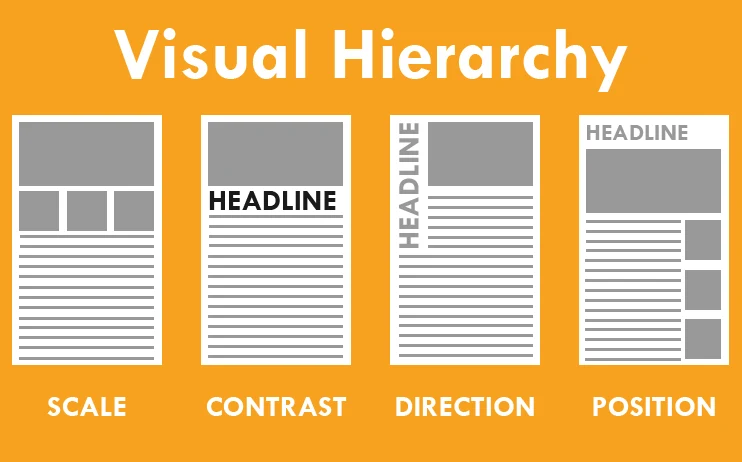
Principles of Visual Hierarchy
- Size: Larger elements tend to attract more attention than smaller ones. Use size to emphasize key information and create a sense of importance.
- Contrast: Contrast in color, shape, and texture can be used to draw attention to specific elements. Use contrasting colors for calls to action or important headings.
- Placement: The placement of elements on a page can also influence their prominence. Elements placed at the top of the page or in the center tend to receive more attention.
- Proximity: Elements that are placed close together are perceived as a group. Use proximity to organize related content and create visual connections.
- Repetition: Repeating certain design elements can create a sense of rhythm and guide the user’s eye. Use repetition sparingly but effectively to emphasize key elements.
- Whitespace: Whitespace, also known as negative space, is the empty space around elements. It can be used to create visual hierarchy by separating elements and drawing attention to specific areas. Let your elements breath! When in doubt more space isn’t going to hurt.
Implementing Visual Hierarchy on Your Website
- Use Headings and Subheadings: Use headings and subheadings to structure your content and create a clear visual hierarchy. Use different font sizes and weights to differentiate between levels of headings.
- Prioritize Content: Determine the most important content on your page and emphasize it using size, contrast, and placement.
- Guide the User’s Eye: Use visual cues, such as arrows, lines, and whitespace, to guide the user’s eye and direct their attention to key elements.
- Test and Iterate: Test your website’s visual hierarchy with real users to ensure that it is effective. Make adjustments based on user feedback.
What’s Next?
Ready to improve your website’s usability with effective visual hierarchy? Take a look at your current website and identify areas for improvement. What changes can you make to guide your users’ eyes and make your content more accessible? Share your questions and insights in the comments below! At Rudtek, we specialize in designing user-friendly websites that are both beautiful and effective. Contact us today to learn more about our web design services!