Hey business owners! Let’s talk about something that’s often overlooked but incredibly powerful in web design: white space. It might seem counterintuitive to focus on empty space, but trust me, it’s a game-changer. Used effectively, white space, also known as negative space, can elevate your website from good to truly exceptional.
What is White Space, Really?
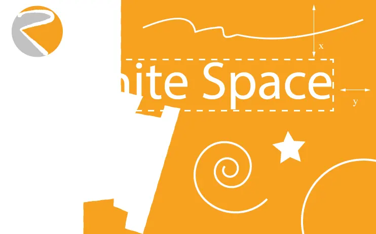
White space isn’t just the absence of content. It’s a design element in itself. It’s the area between and around the elements on your page – text, images, graphics. Think of it as the breathing room for your content. It’s what allows your design to breathe and prevents it from feeling cramped and overwhelming.
We can break white space down into two categories:
- Macro White Space: This refers to the larger areas of empty space, like the margins around your content or the space between major sections of your page.
- Micro White Space: This is the smaller, more detailed spacing, like the gaps between lines of text, the padding around buttons, or the space between individual icons.
Why is White Space So Important?
So, why should you care about white space? Here’s why:
- Improved Readability: Imagine a page crammed with text, no spacing, just a wall of words. Intimidating, right? White space breaks up the text, making it much easier to scan and read. It guides the reader’s eye and improves comprehension.
- Enhanced User Experience: A clean, uncluttered design creates a more pleasant browsing experience. White space helps users focus on what’s important and navigate your site more easily. It reduces cognitive overload and makes your website more inviting.
- Elevated Brand Image: White space can convey a sense of sophistication, elegance, and professionalism. It can help position your brand as high-quality and trustworthy. Think of the clean, minimalist designs of luxury brands – they often make excellent use of white space.
- Increased Focus: Strategically placed white space can draw attention to key elements on your page, like your call to action or a special offer. It helps guide the user’s eye and emphasizes what you want them to see.
How to Use White Space Effectively
Now, let’s get practical. Here are some tips for using white space effectively:
- Don’t Be Afraid of Empty Space: The biggest mistake people make is feeling like every inch of their website needs to be filled. Embrace the empty space! It’s your friend.
- Think Strategically: Don’t just add white space randomly. Consider how it can improve readability, create visual hierarchy, and guide the user’s eye.
- Maintain Consistency: Use white space consistently throughout your website. This helps create a cohesive and professional look.
- Balance Macro and Micro: Pay attention to both the large and small spaces. Both are important for creating a balanced and visually appealing design.
White space is a powerful design tool that can significantly impact your website’s effectiveness. By understanding its principles and using it strategically, you can create a website that is not only beautiful but also user-friendly and successful.
What’s Next?
Ready to take your web design to the next level? At Rudtek, we specialize in creating beautiful and effective websites that help businesses like yours thrive. Contact us today for a free consultation! We can help you harness the power of white space and other design principles to create a website that truly shines. What are your biggest challenges with web design? Share your thoughts in the comments below! We’d love to hear from you.