One of the often-overlooked elements of effective content marketing is typography. Yes, fonts! They’re not just letters; they’re the voice of your brand, whispering (or shouting!) your message to the world. And a crucial part of that voice is font pairing.
Why Font Pairing Matters for Your Business
Think of your brand as a person. Would you wear a mismatched outfit to an important meeting? Probably not! Similarly, using clashing fonts in your marketing materials creates a sense of visual dissonance, confusing your audience and weakening your message. Effective font pairing, on the other hand, creates harmony, enhances readability, and reinforces your brand identity. It’s a subtle but powerful way to elevate your content marketing and boost your bottom line.
First Impressions: The Power of Visual Communication
In today’s fast-paced world, people make snap judgments. Your visuals, including your fonts, are often the first thing they notice. A well-chosen font pairing can instantly communicate professionalism, trustworthiness, creativity, or any other brand attribute you want to project. It’s like a visual handshake, making a strong first impression and setting the stage for a positive customer experience.
Enhancing Readability: Making Your Message Stick
Let’s face it: no one wants to struggle to read your content. Poor font choices can lead to eye strain, confusion, and ultimately, a lost audience. Font pairing plays a crucial role in readability. By combining fonts that complement each other, you can create a visually appealing hierarchy that guides the reader’s eye and makes your message clear and concise.
Reinforcing Brand Identity: Building a Consistent Visual Language
Your brand is more than just a logo. It’s a collection of visual and verbal cues that tell your story and differentiate you from the competition. Consistent font pairing across all your marketing materials – from your website to your social media posts – helps create a cohesive brand identity that resonates with your target audience.
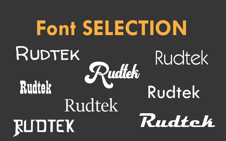
Simple Font Pairing Concepts: A Beginner’s Guide
Don’t worry, you don’t need a degree in typography to master the basics of font pairing. Here are a few simple concepts to get you started:
1. Contrast is Key: Creating Visual Interest
The most successful font pairing often involves combining fonts that are significantly different from each other. This contrast creates visual interest and helps distinguish between different types of content, such as headings and body text.
- Serif vs. Sans Serif: A classic combination is pairing a serif font (with small decorative strokes) for headings with a sans serif font (without strokes) for body text. This creates a clean and professional look.
- Display vs. Text: Use a bolder, more decorative display font for headings and a simpler, more readable text font for body copy.
2. Complementary Styles: Finding the Right Balance
While contrast is important, your chosen fonts should also complement each other. They should share some common characteristics, such as similar weights, proportions, or overall style.
- Similar Font Families: Consider using different weights or styles within the same font family. For example, you could pair a bold version of a font for headings with a regular version for body text.
- Harmonious Mood: Choose fonts that evoke a similar feeling or tone. For example, if you’re aiming for a friendly and approachable brand, select fonts that reflect that personality.
3. The Rule of Two (or Three): Keeping it Simple
As a general rule, it’s best to stick to two or three fonts in your marketing materials. Too many fonts can create a cluttered and confusing look.
- One for Headings: A bold and eye-catching font to grab attention.
- One for Body Text: A legible and comfortable font for reading.
- (Optional) One for Accents: A decorative font to highlight key phrases or call-outs.
Font Pairing Examples for Content Marketing
Let’s look at some practical examples:
- Classic & Professional: Playfair Display (Headings) + Open Sans (Body Text)
- Modern & Clean: Montserrat (Headings) + Lato (Body Text)
- Friendly & Approachable: Pacifico (Headings) + Source Sans Pro (Body Text)
(These are just examples; many other great pairings exist. Font pairing tools can help you discover more options.)
Resources to Explore
Here are some resources to help you dive deeper into the world of typography and font pairing:
- Google Fonts – A vast library of free fonts.
- FontPair – A tool for finding font pairings.
- Adobe Fonts – High-quality fonts for professional use.
Making it Work for Your Business
Remember, the best font pairing is one that aligns with your brand identity and resonates with your target audience. Don’t be afraid to experiment and try different combinations until you find what works best for you.
What’s Next?
What are your go-to font pairings for content marketing? Share your favorites in the comments below! I’d love to hear from you. And if you’re struggling with typography or other design elements for your business, don’t hesitate to reach out. I’m here to help you create a brand that truly shines.